Welcome to Box Art Brawl, our weekly contest that pits three box art variants from around the world against each other in a fight for your vote.
Last week observed three versions of ActRaiser 2 locked in combat. While Japan trailed from the very beginning, it was an exceptionally close fight between North America and Europe. At the time of writing, though, there is a clear winner with only the slimmest of margins – the slimmest possible, in fact.
As we write this on a Friday evening, the results are as follows:
- North America: 335 votes
- Japan: 289 votes
- Europe: 336 votes
Therefore, Europe wins by a whisper! Congratulations and commiserations as appropriate.
This week we’re sticking once again with the SNES (hey, it’s a great console!) and taking a look at Compile’s 1992 vertical scrolling shmup Super Aleste, or Space Megaforce as it’s known in North America. With a name like that, how could we resist?
Let’s barrel roll right in.
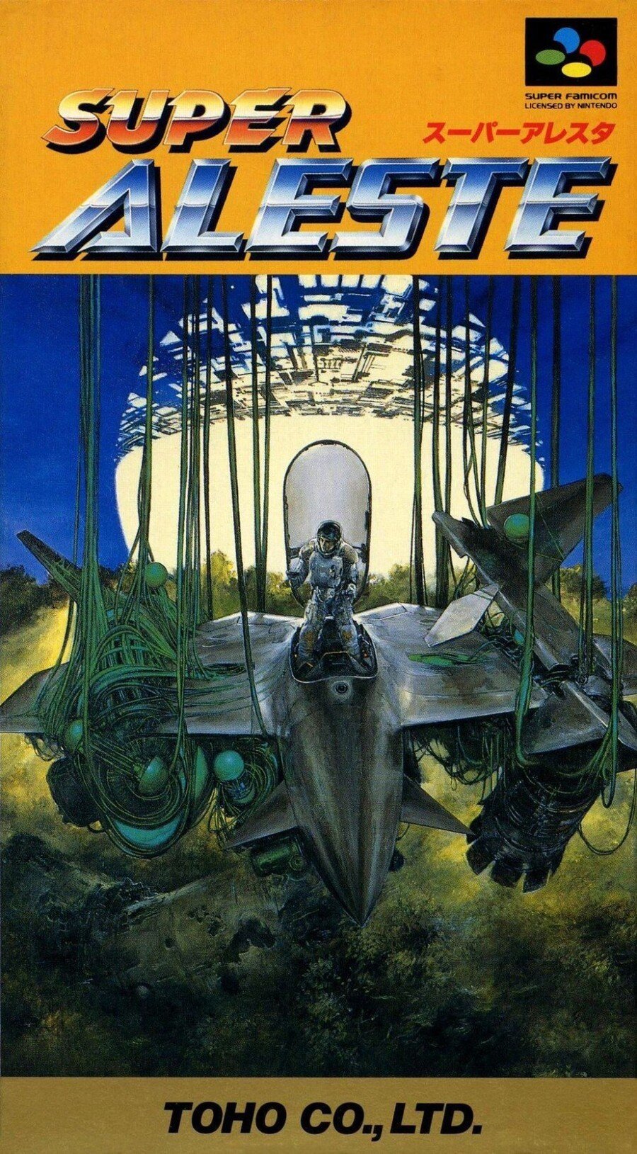
Japan

It’s not a bad start, is it? The Super Famicom cover kicks things off in style with a rich yellow strip at the top acting as the background to a beautifully shiny and embossed logo that couldn’t be more late-’80s/early-’90s if it tried.
Below that is an intriguing image of the titular craft hanging by green tendrils above the jungle. If you’re not familiar with the story, you’ll have no idea what’s going on… but it really doesn’t matter. The image of the pilot in the open cockpit against the bright sphere in the background grabs your attention and makes you want to know more.
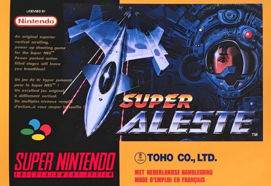
Europe

The European version retains the title and the exact same logo treatment along with a cracking piece of art which blends ’80s sci-fi with ’80s fighter jet porn.
There’s an awful lot to like. The rich yellow is back in the border this time. There’s a needlessly long tagline that explains the game quite precisely. There’s even a little bit of French on the box to give it an air of sophistication. What more could you possibly want?
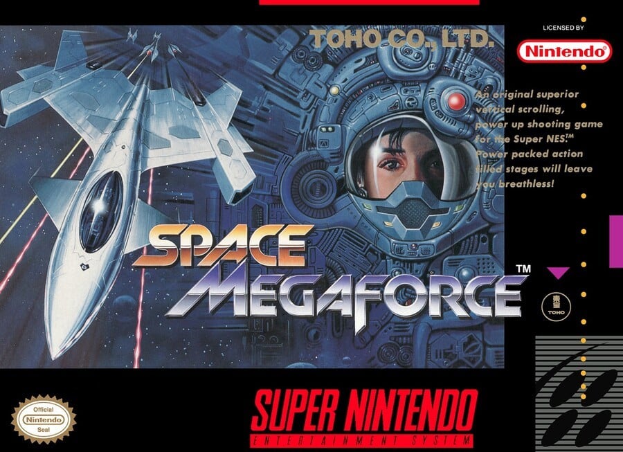
North America

The North American cover uses the same great art as the EU version but shifts it over to the left. The tagline remains the same but the mustard-coloured border is switched out for the standard black.
The biggest change is the different title and logo for the NA release. It resembles the original in shininess and impact but goes for a slightly more ‘sci-fi’ font. Again, very ’80s, very cool. The actual name itself couldn’t be more generic, yet there’s something pleasing in its banal fusion of cool word + cool word + cool word = very cool words.
Three covers, one vote. Pick your favourite, give it a click, and click on the ‘Vote’ button:
And that’s all for this week. Next time on Box Art Brawl, it’ll be round #52. That’s right – we’ve had one whole year of box art battling! We’ll see you then.

Leave a Reply